Excel becomes production work
The same exports, corrections, pivot tables and checks have to be repeated every week.
Datalab creates dashboards and BI environments that help teams see what is happening, where deviations arise and which actions are needed. We help with KPIs, data models, tooling, reporting, adoption and, where needed, the data foundation underneath.
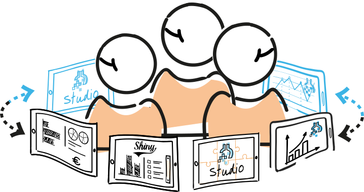
Excel and manual reports are often perfectly fine to start with. Dashboards & BI become valuable once the same numbers come back often, several people work with them, or decisions need to be made faster and more reliably.
The same exports, corrections, pivot tables and checks have to be repeated every week.
Numbers only become available after the opportunity to steer has already passed.
Finance, operations and management look at reports with slightly different definitions.
A report shows what happened, but users cannot drill down to the cause or detail.
Targets, margins, stock, capacity or quality deviate without anyone receiving a timely signal.
A dashboard makes definitions, filters and calculations transferable to more users.
Dashboards and business intelligence translate data into management information. That can be an overview for executives or management, but also an interactive analytics environment for controllers, account managers, planners or operational teams.
A good dashboard does more than display figures. It makes clear which KPIs matter, which definitions apply, which filters are reliable and which action belongs to a deviation. Sometimes that is compact and visual; sometimes it is an analytics tool that lets users drill down deeply.
Further reading
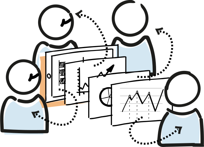
A dashboard does not always have to start with a data warehouse. For a defined question, a reliable source or a first prototype, a direct connection to Excel, a database, an API or exports can be enough. That can deliver value quickly and helps clarify which information users really need.
A data warehouse becomes useful when dashboards combine several sources, need to retain history, become slow, contain complex calculations or are used by many teams. Then you move logic out of the BI tool into a stable data foundation. That makes dashboards faster, easier to manage and less dependent on one report builder.
Further reading
A data model is not always needed immediately either. For a small dashboard, a simple dataset with clear columns may be enough. But once definitions recur across several reports, multiple teams use the same KPI or calculations become sensitive, an explicit data model pays off.
Further reading
The right tool depends on users, management, existing licences, desired interactivity and the technical environment. Datalab is independent and would rather choose what fits than what is popular.
Strong when organisations already work in the Microsoft ecosystem and want to publish dashboards quickly. Pay attention to performance, DAX complexity, licences and data preparation.
Power BI consultantSuitable for visual analysis, interactive exploration and organisations that value data visualisation highly. Source data quality and definitions remain decisive.
Tableau consultantFor custom dashboards, interactive web apps, input tools and analytics environments where standard BI tools are too limiting. Ideal when flexibility and control matter more than standard publication flows.
R Shiny consultantWorking with another BI system, such as Looker Studio, Qlik, Superset or Metabase? We are happy to think along about a suitable setup.
Dashboards & BI make management information available faster and easier to discuss. The goal is not more charts, but less debate about numbers and more time for decisions, actions and improvement.

Datalab works for retail, accountancy, public organisations, healthcare, logistics and knowledge-intensive teams.
They also trust Datalab
We do not start with the chart, but with the decision that needs to be made. Which user looks at the dashboard, which action should become possible and which definition determines whether a value is good or bad?
Then we build iteratively: first the most important KPIs and datasets, then depth, filters, permissions, documentation and adoption. Where needed, we improve the underlying data source, data model or data warehouse at the same time.
100% independent
We are not tied to Power BI, Tableau, R Shiny or any cloud platform. The user question and management context determine the technology.
We determine which decisions, KPIs, reports and users are central.
We choose the right route: direct source, dataset, data model, data warehouse or a combination.
We develop iteratively with real users, so filters, visuals and detail fit daily practice.
We document definitions, train users and continue building on new questions or sources.

For dashboards, technology is only part of the work. KPIs need to make business sense, definitions must be explainable and reports need to connect with budgets, margins, forecasts and management meetings.
When financial or control expertise is needed, we can work with BPO - De Administratie. Datalab sets up the data, dashboards and BI environment; BPO helps as a part-time CFO/controller with KPI choices, interpretation, budget control and the management rhythm around the numbers.
Not always. For a first dashboard, a reliable source or limited reporting, a direct connection may be enough. A data warehouse becomes especially useful with multiple sources, history, complex calculations, performance issues or reuse by several teams.
A report is often periodic and focused on accountability: what happened? A dashboard is usually more interactive and current: where are we now, what deviates and where should we drill down? In practice the forms sometimes overlap.
Yes. We can make existing reports faster, clearer and more reliable. Sometimes the improvement is in Power BI itself; sometimes it is in the data model, source connection or moving calculations into a database or data warehouse.
A data model defines how technical source data is translated into usable concepts, relationships and KPIs. This makes dashboards more consistent and prevents calculations from being reinvented in every report. Also read about DBT & data modelling.
For recurring reporting and shared management information, often yes. Excel remains useful for ad-hoc analysis, checking and scenarios. The trick is to move structural reporting out of fragile spreadsheets while giving users enough flexibility for their own analyses.
By involving users early, making definitions explicit, not showing too many KPIs at once and connecting the dashboard to existing meeting and decision rhythms. Adoption is part of the work, not something that starts only after delivery.
Yes. Depending on the tool, we can set up periodic reports, email updates, alerts or signals. This is especially useful when users do not look at a dashboard every day, but do need to know when a value requires attention. If a signal also needs to automatically start a follow-up action, Process Automation fits alongside it.
Both. A dashboard only works when technology, definitions and business context come together. Where needed, we work with BPO - De Administratie for CFO and controller expertise around KPIs, budgets, margins and management reporting. For hands-on help with financial data integration or reporting structures, see our financial data consultant. For retail dashboards around margin, stock, channel performance and operations, Retail Studio is often a better fit.
That depends on the sources and how sharp the information question is. Often we can start with a compact first use case and then expand with additional sources, data models, dashboards or a data warehouse when needed.
In a short conversation, we map out your data sources, information needs and technical context and outline a feasible first step.
Schedule a call